Breathing Room
The use of negative space, also referred to as white space, allows the viewer to easily absorb information and navigate from section to section. To produce a legible and neat project, remain conscious of space around text blocks. Placing text over images should be done sparingly, as it may diminish readability and detract from the overall design.

Architectural Detail
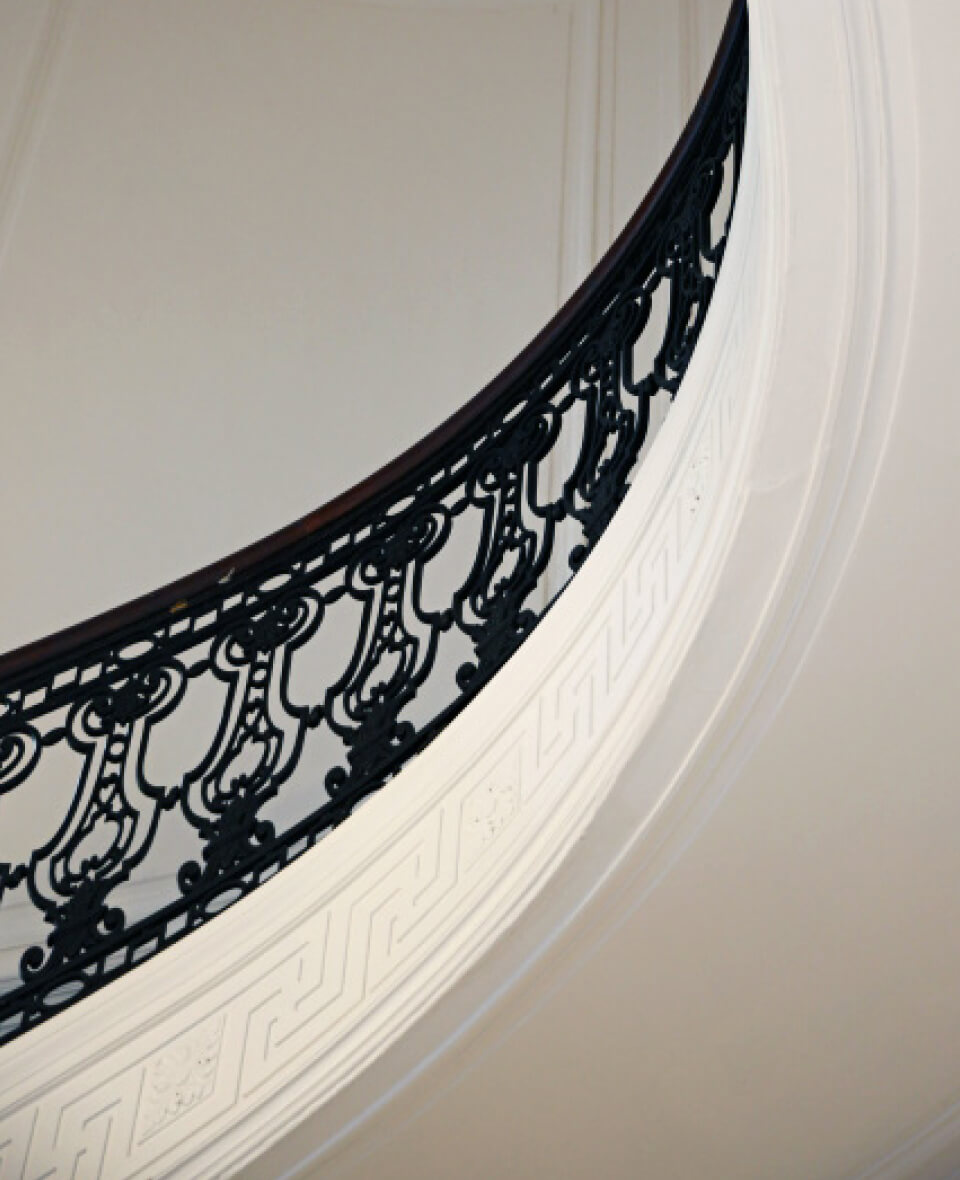
One of the benefits of having beautifully designed signature buildings on campus, such as The Great Hall and Guggenheim Memorial Library, is a rich collection of photography highlighting unique architectural details. Photography of these interior and exterior structures can be used as backgrounds and design elements to create an elevated design with a distinct academic feel.


Color Story
The primary brand colors are Shadow Blue (Pantone 295) and White, but a variety of secondary and tertiary colors are available as accent colors. Inspired by our unique location on the East Coast and our historic campus, the blues and grays of the ocean are complemented by the bright, Gilded Age stained glass ceiling that spans the width of The Great Hall.


Typography
The primary fonts are Utopia and Proxima Nova. Utopia is a tall, strong, and elegant serif font. It is best used for important academic and University-wide materials. Proxima Nova is a simple and friendly sans serif font. It conveys a more casual attitude that is best utilized for materials targeted for student events and affairs.

Brand Consistency
To maintain brand consistency, it is vital to avoid “logo confusion,” meaning a distinctive visual identity should not be created for each event, series, project, or program. Please contact University Marketing & Communications to discuss creative solutions for exceptional circumstances that may require higher-level design consideration.


